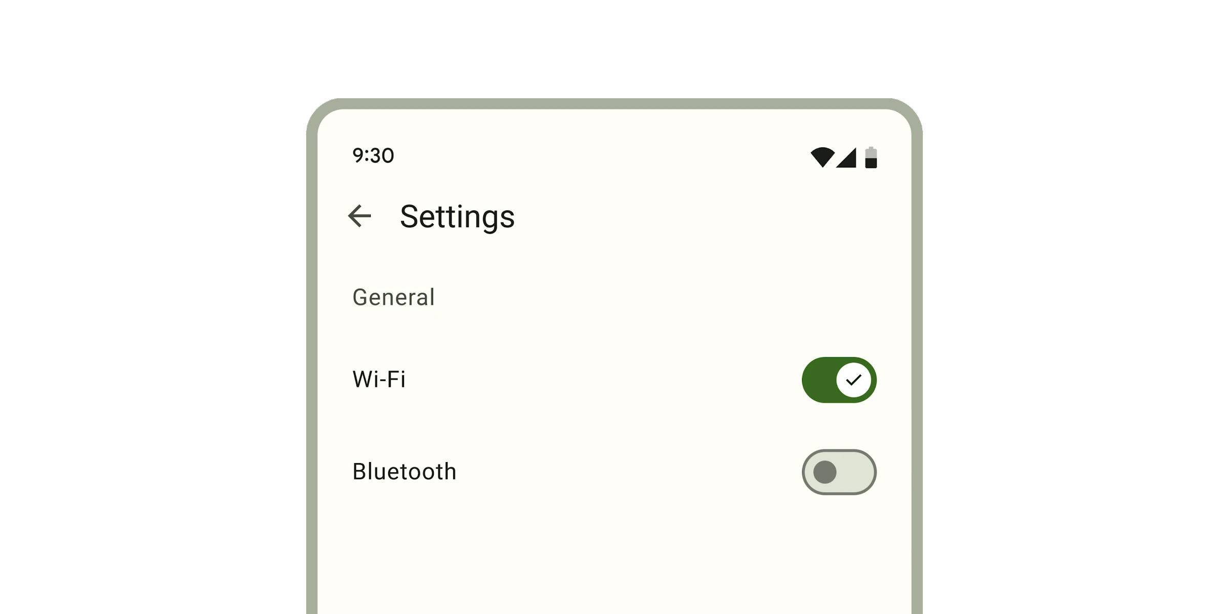
# Switch
**This documentation is fully rendered on the
[Material Web catalog](https://material-web.dev/components/switch/).**
[Switches](https://m3.material.io/components/switch) toggle the state
of an item on or off.
* [Design article](https://m3.material.io/components/switch)
* [API Documentation](#api)
* [Source code](https://github.com/material-components/material-web/tree/main/switch)
## Usage
Switches are similar to checkboxes, and can be unselected or selected.
```html
` element.
```html
Wi-Fi
Bluetooth
All
```
> Note: switches are not automatically labelled by `` elements and always
> need an `aria-label`. See b/294081528.
## Theming
Switches supports [Material theming](../theming/README.md) and can be customized
in terms of color and shape.
### Tokens
Token | Default value
----------------------------------- | ------------------------------------------
`--md-switch-handle-color` | `--md-sys-color-outline`
`--md-switch-handle-shape` | `--md-sys-shape-corner-full`
`--md-switch-track-color` | `--md-sys-color-surface-container-highest`
`--md-switch-track-shape` | `--md-sys-shape-corner-full`
`--md-switch-selected-handle-color` | `--md-sys-color-on-primary`
`--md-switch-selected-track-color` | `--md-sys-color-primary`
* [All tokens](https://github.com/material-components/material-web/blob/main/tokens/_md-comp-switch.scss)
### Example
```html
<md-switch>
#### Properties
| Property | Attribute | Type | Default | Description |
| --- | --- | --- | --- | --- |
| `selected` | `selected` | `boolean` | `false` | Puts the switch in the selected state and sets the form submission value to the `value` property. |
| `icons` | `icons` | `boolean` | `false` | Shows both the selected and deselected icons. |
| `showOnlySelectedIcon` | `show-only-selected-icon` | `boolean` | `false` | Shows only the selected icon, and not the deselected icon. If `true`, overrides the behavior of the `icons` property. |
| `required` | `required` | `boolean` | `false` | When true, require the switch to be selected when participating in form submission. 
