# Tabs
**This documentation is fully rendered on the
[Material Web catalog](https://material-web.dev/components/tabs/)**
[Tabs](https://m3.material.io/components/tabs) organize groups of
related content that are at the same level of hierarchy.
 * [Design article](https://m3.material.io/components/tabs)
* [API Documentation](#api)
* [Source code](https://github.com/material-components/material-web/tree/main/tabs)
## Types
1. [Primary tabs](#primary-tabs)
1. [Secondary tabs](#secondary-tabs)
## Usage
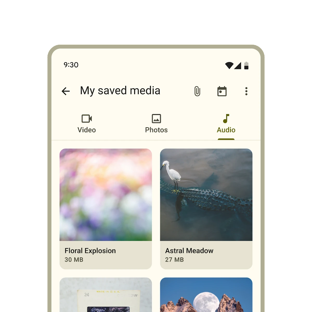
Tabs contain multiple primary or secondary tab children. Use the same type of
tab in a tab bar.
```html
Video
Photos
Audio
Birds
Cats
Dogs
```
### Selection
Add an `active` attribute to change which tab is selected.
```html
Video
Photos
Audio
```
To observe changes to tab selections, add an event listener to ``,
listening for the `change` event.
```ts
tabs.addEventListener('change', (event: Event) => {
if (event.target.activeTabIndex === 2) {
// ... perform logic only if index of selected item is 2.
}
});
```
### Icons
Tabs may optionally show an icon.
Icons communicate the type of content within a tab. Icons should be simple and
recognizable.
```html
piano
Keyboard
tune
Guitar
```
Tabs may optionally show icons without a label.
```html
piano
tune
```
## Primary tabs
Primary tabs are placed at the top of the content pane under a top app bar. They
display the main content destinations.
```html
piano
Keyboard
tune
Guitar
```
### Inline icons
Primary tabs can show their icons inline, like secondary tabs.
```html
piano
Keyboard
tune
Guitar
```
## Secondary tabs
Secondary tabs are used within a content area to further separate related
content and establish hierarchy.
```html
flight
Travel
hotel
Hotel
hiking
Activities
```
## Accessibility
Add an
[`aria-label`](https://developer.mozilla.org/en-US/docs/Web/Accessibility/ARIA/Attributes/aria-label)
attribute to `` and any individual tab whose label needs to be more
descriptive, such as icon-only tabs.
```html
photo
videocam
audiotrack
```
### Tab panels
Every tab must reference a
[`role="tabpanel"`](https://developer.mozilla.org/en-US/docs/Web/Accessibility/ARIA/Roles/tabpanel_role)
element with `aria-controls`. Tab panels must be labelled with `aria-label` or
`aria-labelledby`.
It's common to reference the panel's tab with `aria-labelledby`.
```html
Photos
Videos
Music
* [Design article](https://m3.material.io/components/tabs)
* [API Documentation](#api)
* [Source code](https://github.com/material-components/material-web/tree/main/tabs)
## Types
1. [Primary tabs](#primary-tabs)
1. [Secondary tabs](#secondary-tabs)
## Usage
Tabs contain multiple primary or secondary tab children. Use the same type of
tab in a tab bar.
```html
Video
Photos
Audio
Birds
Cats
Dogs
```
### Selection
Add an `active` attribute to change which tab is selected.
```html
Video
Photos
Audio
```
To observe changes to tab selections, add an event listener to ``,
listening for the `change` event.
```ts
tabs.addEventListener('change', (event: Event) => {
if (event.target.activeTabIndex === 2) {
// ... perform logic only if index of selected item is 2.
}
});
```
### Icons
Tabs may optionally show an icon.
Icons communicate the type of content within a tab. Icons should be simple and
recognizable.
```html
piano
Keyboard
tune
Guitar
```
Tabs may optionally show icons without a label.
```html
piano
tune
```
## Primary tabs
Primary tabs are placed at the top of the content pane under a top app bar. They
display the main content destinations.
```html
piano
Keyboard
tune
Guitar
```
### Inline icons
Primary tabs can show their icons inline, like secondary tabs.
```html
piano
Keyboard
tune
Guitar
```
## Secondary tabs
Secondary tabs are used within a content area to further separate related
content and establish hierarchy.
```html
flight
Travel
hotel
Hotel
hiking
Activities
```
## Accessibility
Add an
[`aria-label`](https://developer.mozilla.org/en-US/docs/Web/Accessibility/ARIA/Attributes/aria-label)
attribute to `` and any individual tab whose label needs to be more
descriptive, such as icon-only tabs.
```html
photo
videocam
audiotrack
```
### Tab panels
Every tab must reference a
[`role="tabpanel"`](https://developer.mozilla.org/en-US/docs/Web/Accessibility/ARIA/Roles/tabpanel_role)
element with `aria-controls`. Tab panels must be labelled with `aria-label` or
`aria-labelledby`.
It's common to reference the panel's tab with `aria-labelledby`.
```html
Photos
Videos
Music
...
...
...
```
## Theming
Tabs supports [Material theming](../theming/README.md) and can be customized in
terms of color, typography, and shape.
### Primary tab tokens
Token | Default value
----------------------------------------- | -------------
`--md-primary-tab-container-color` | `--md-sys-color-surface`
`--md-primary-tab-label-text-font` | `--md-sys-typescale-title-small-font`
`--md-primary-tab-active-indicator-color` | `--md-sys-color-primary`
`--md-primary-tab-icon-color` | `--md-sys-color-on-surface-variant`
`--md-primary-tab-container-shape` | `--md-sys-shape-corner-none`
* [All tokens](https://github.com/material-components/material-web/blob/main/tokens/_md-comp-primary-tab.scss)
### Primary tab example

```html
Tab 1
Tab 2
Tab 3
```
### Secondary tab tokens
Token | Default value
------------------------------------------- | -------------
`--md-secondary-tab-container-color` | `--md-sys-color-surface`
`--md-secondary-tab-label-text-font` | `--md-sys-typescale-title-small-font`
`--md-secondary-tab-active-indicator-color` | `--md-sys-color-primary`
`--md-secondary-tab-icon-color` | `--md-sys-color-on-surface-variant`
`--md-secondary-tab-container-shape` | `--md-sys-shape-corner-none`
* [All tokens](https://github.com/material-components/material-web/blob/main/tokens/_md-comp-secondary-tab.scss)
### Secondary tab example
```html
Tab 1
Tab 2
Tab 3
```
## API
### MdTabs <md-tabs>
#### Properties
| Property | Attribute | Type | Default | Description |
| --- | --- | --- | --- | --- |
| `autoActivate` | `auto-activate` | `boolean` | `false` | Whether or not to automatically select a tab when it is focused. |
| `activeTabIndex` | `active-tab-index` | `number` | `undefined` | |
| `tabs` | | `Tab[]` | `undefined` | The tabs of this tab bar. |
| `activeTab` | | `Tab` | `undefined` | |
#### Methods
| Method | Parameters | Returns | Description |
| --- | --- | --- | --- |
| `scrollToTab` | `tabToScrollTo` | `Promise` | Scrolls the toolbar, if overflowing, to the active tab, or the provided tab. |
#### Events
| Event | Type | [Bubbles](https://developer.mozilla.org/en-US/docs/Web/API/Event/bubbles) | [Composed](https://developer.mozilla.org/en-US/docs/Web/API/Event/composed) | Description |
| --- | --- | --- | --- | --- |
| `change` | `Event` | Yes | No | Fired when the selected tab changes. The target's `activeTabIndex` or `activeTab` provide information about the selection change. The change event is fired when a user interaction like a space/enter key or click cause a selection change. The tab selection based on these actions can be cancelled by calling preventDefault on the triggering `keydown` or `click` event. |
### MdPrimaryTab <md-primary-tab>
#### Properties
| Property | Attribute | Type | Default | Description |
| --- | --- | --- | --- | --- |
| `inlineIcon` | `inline-icon` | `boolean` | `false` | Whether or not the icon renders inline with label or stacked vertically. |
| `isTab` | `md-tab` | `boolean` | `true` | The attribute `md-tab` indicates that the element is a tab for the parent element, ``. Make sure if you're implementing your own `md-tab` component that you have an `md-tab` attribute set. |
| `active` | `active` | `boolean` | `false` | Whether or not the tab is selected. |
| `hasIcon` | `has-icon` | `boolean` | `false` | In SSR, set this to true when an icon is present. |
| `iconOnly` | `icon-only` | `boolean` | `false` | In SSR, set this to true when there is no label and only an icon. |
| `selected` | `selected` | `boolean` | `undefined` | |
### MdSecondaryTab <md-secondary-tab>
#### Properties
| Property | Attribute | Type | Default | Description |
| --- | --- | --- | --- | --- |
| `isTab` | `md-tab` | `boolean` | `true` | The attribute `md-tab` indicates that the element is a tab for the parent element, ``. Make sure if you're implementing your own `md-tab` component that you have an `md-tab` attribute set. |
| `active` | `active` | `boolean` | `false` | Whether or not the tab is selected. |
| `hasIcon` | `has-icon` | `boolean` | `false` | In SSR, set this to true when an icon is present. |
| `iconOnly` | `icon-only` | `boolean` | `false` | In SSR, set this to true when there is no label and only an icon. |
| `selected` | `selected` | `boolean` | `undefined` | |