# Sliders
**This documentation is fully rendered on the
[Material Web catalog](https://material-web.dev/components/slider/)**
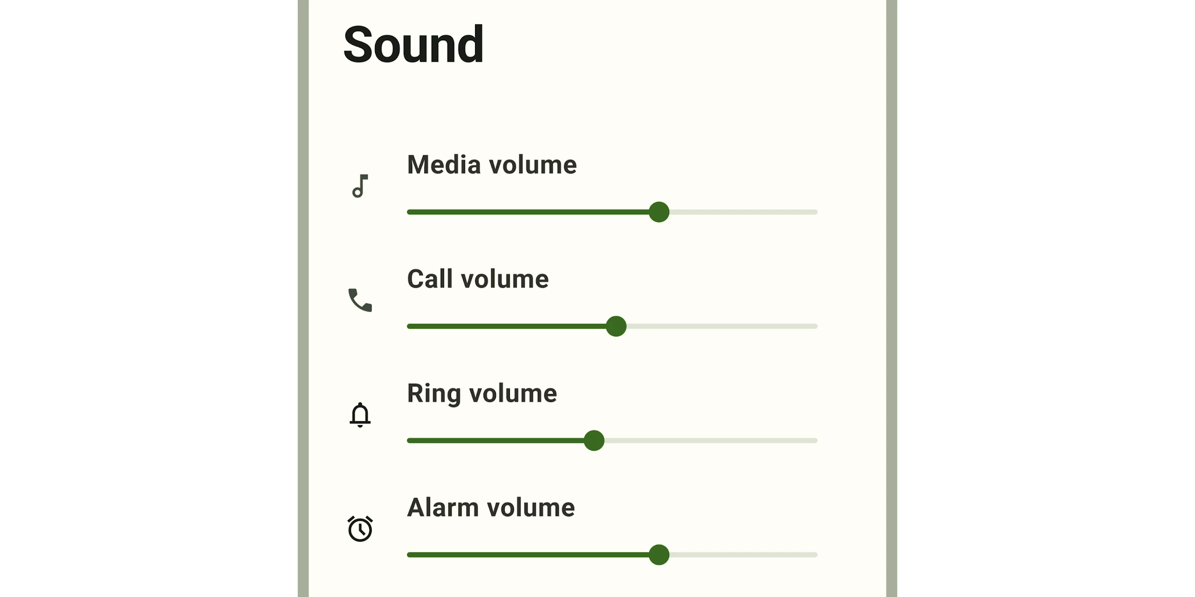
[Sliders](https://m3.material.io/components/sliders) allow users to
view and select a value (or range) along a track. They're ideal for adjusting
settings such as volume and brightness, or for applying image filters.
Sliders can use icons or labels to represent a numeric or relative scale.
* [Design article](https://m3.material.io/components/sliders)
* [API Documentation](#api)
* [Source code](https://github.com/material-components/material-web/tree/main/slider)
## Usage
Sliders may be continuous or discrete, and may also represent a range.
```html
```
### Continuous
Allows users to select a value along a subjective range.
```html
```
### Discrete
Allows users to select a specific value from a predetermined range. Tick marks
may be used to indicate available values.
```html
```
### Range
A range slider has two handles, and indicates a minimum and maximum value in a
range.
```html
```
### Value label
A value label displays the specific value that corresponds with the handle's
placement.
The label appears when the handle is selected. For range sliders, labels appear
when either handle is selected.
```html
```
## Theming
Slider supports [Material theming](../theming/README.md) and can be customized
in terms of color and shape.
### Tokens
Token | Default value
---------------------------------- | ------------------------------------------
`--md-slider-active-track-color` | `--md-sys-color-primary`
`--md-slider-active-track-shape` | `--md-sys-shape-corner-full`
`--md-slider-inactive-track-color` | `--md-sys-color-surface-container-highest`
`--md-slider-inactive-track-shape` | `--md-sys-shape-corner-full`
`--md-slider-handle-color` | `--md-sys-color-primary`
`--md-slider-handle-shape` | `--md-sys-shape-corner-full`
* [All tokens](https://github.com/material-components/material-web/blob/main/tokens/_md-comp-slider.scss)
### Example

```html
```
## API
### MdSlider <md-slider>
#### Properties
| Property | Attribute | Type | Default | Description |
| --- | --- | --- | --- | --- |
| `min` | `min` | `number` | `0` | The slider minimum value |
| `max` | `max` | `number` | `100` | The slider maximum value |
| `value` | `value` | `number` | `undefined` | The slider value displayed when range is false. |
| `valueStart` | `value-start` | `number` | `undefined` | The slider start value displayed when range is true. |
| `valueEnd` | `value-end` | `number` | `undefined` | The slider end value displayed when range is true. |
| `valueLabel` | `value-label` | `string` | `''` | An optional label for the slider's value displayed when range is false; if not set, the label is the value itself. |
| `valueLabelStart` | `value-label-start` | `string` | `''` | An optional label for the slider's start value displayed when range is true; if not set, the label is the valueStart itself. |
| `valueLabelEnd` | `value-label-end` | `string` | `''` | An optional label for the slider's end value displayed when range is true; if not set, the label is the valueEnd itself. |
| `ariaLabelStart` | `aria-label-start` | `string` | `''` | Aria label for the slider's start handle displayed when range is true. |
| `ariaValueTextStart` | `aria-valuetext-start` | `string` | `''` | Aria value text for the slider's start value displayed when range is true. |
| `ariaLabelEnd` | `aria-label-end` | `string` | `''` | Aria label for the slider's end handle displayed when range is true. |
| `ariaValueTextEnd` | `aria-valuetext-end` | `string` | `''` | Aria value text for the slider's end value displayed when range is true. |
| `step` | `step` | `number` | `1` | The step between values. |
| `ticks` | `ticks` | `boolean` | `false` | Whether or not to show tick marks. |
| `labeled` | `labeled` | `boolean` | `false` | Whether or not to show a value label when activated. |
| `range` | `range` | `boolean` | `false` | Whether or not to show a value range. When false, the slider displays a slideable handle for the value property; when true, it displays slideable handles for the valueStart and valueEnd properties. |
| `disabled` | | `boolean` | `undefined` | |
| `name` | | `string` | `undefined` | |
| `nameStart` | | `string` | `undefined` | |
| `nameEnd` | | `string` | `undefined` | |
#### Methods
| Method | Parameters | Returns | Description |
| --- | --- | --- | --- |
| `formResetCallback` | _None_ | `void` | |
| `formStateRestoreCallback` | `state` | `void` | |
#### Events
| Event | Type | [Bubbles](https://developer.mozilla.org/en-US/docs/Web/API/Event/bubbles) | [Composed](https://developer.mozilla.org/en-US/docs/Web/API/Event/composed) | Description |
| --- | --- | --- | --- | --- |
| `change` | `Event` | Yes | No | The native `change` event on [``](https://developer.mozilla.org/en-US/docs/Web/API/HTMLElement/change_event) |
| `input` | `InputEvent` | Yes | Yes | The native `input` event on [``](https://developer.mozilla.org/en-US/docs/Web/API/HTMLElement/input_event) |