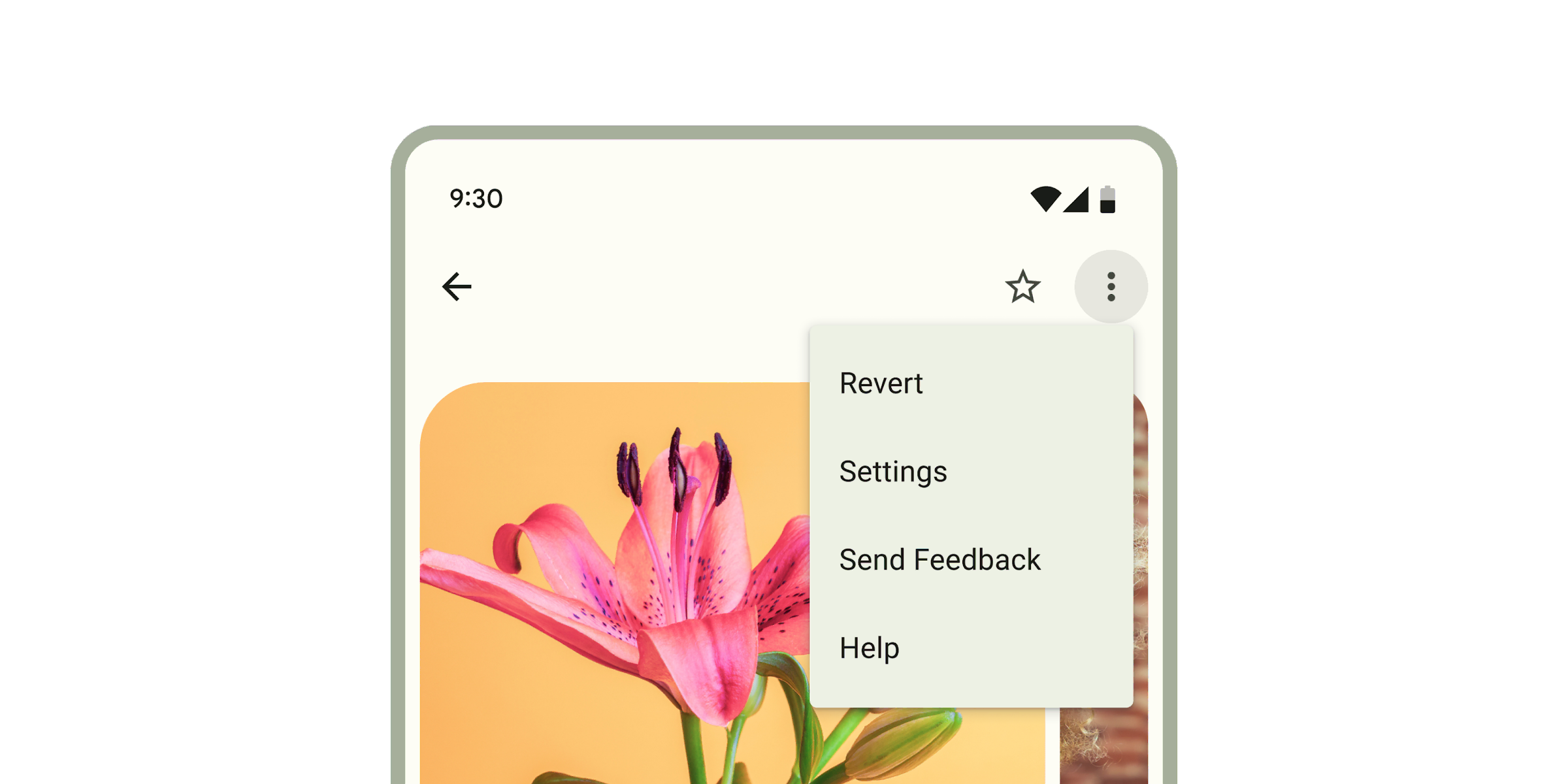
# Menus
**This documentation is fully rendered on the
[Material Web catalog](https://material-web.dev/components/menu/).**
[Menus](https://m3.material.io/components/menus) display a list of
choices on a temporary surface.
 * [Design article](https://m3.material.io/components/menus)
* [API Documentation](#api)
* [Source code](https://github.com/material-components/material-web/tree/main/menu)
## Usage
When opened, menus position themselves to an anchor. Thus, either `anchor` or
`anchorElement` must be supplied to `md-menu` before opening. Additionally, a
shared parent of `position:relative` should be present around the menu and it's
anchor, because the default menu is positioned relative to the anchor element.
Menus also render menu items such as `md-menu-item` and handle keyboard
navigation between `md-menu-item`s as well as typeahead functionality.
Additionally, `md-menu` interacts with `md-menu-item`s to help you determine how
a menu was closed. Listen for and inspect the `close-menu` custom event's
`details` to determine what action and items closed the menu.
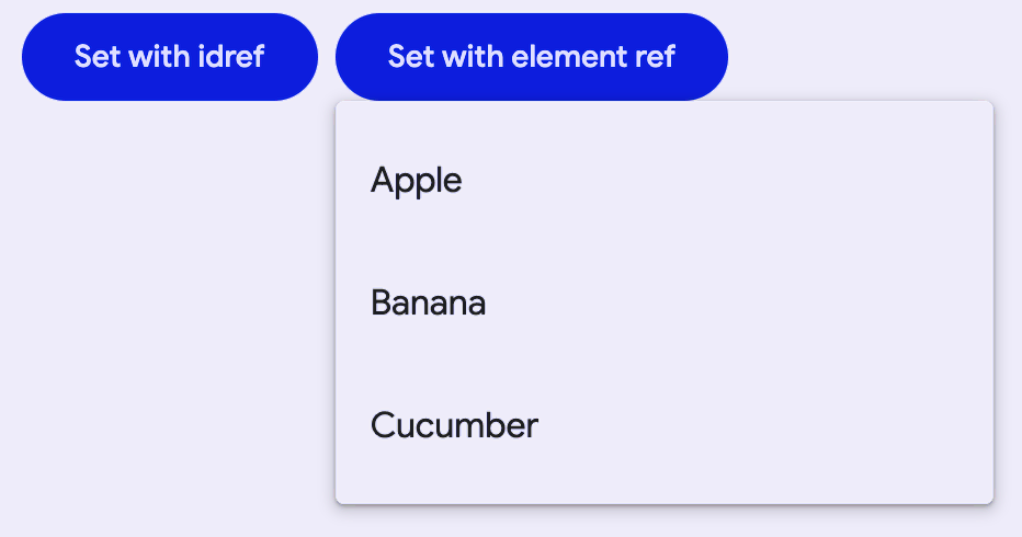
```html
Set with idref
Set with element ref
```
### Submenus
You can compose ``s inside of an ``'s `menu` slot, but
first the `has-overflow` attribute must be set on the root `` to
disable overflow scrolling and display the nested submenus.
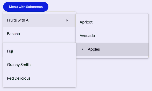
```html
```
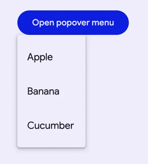
### Popover-positioned menus
Internally menu uses `position: absolute` by default. Though there are cases
when the anchor and the node cannot share a common ancestor that is `position:
relative`, or sometimes, menu will render below another item due to limitations
with `position: absolute`.
Popover-positioned menus use the native
[Popover API](https://developer.mozilla.org/en-US/docs/Web/API/Popover_API)
to render above all other content. This may fix most issues where the default
menu positioning (`positioning="absolute"`) is not positioning as expected by
rendering into the
[top layer](https://developer.mozilla.org/en-US/docs/Glossary/Top_layer).
> Warning: Popover API support was added in Chrome 114 and Safari 17. At the
> time of writing, Firefox does not support the Popover API
> ([see latest browser compatibility](https://developer.mozilla.org/en-US/docs/Web/API/Popover_API#browser_compatibility)).
>
> For browsers that do not support the Popover API, `md-menu` will fall back to
> using [fixed-positioned menus](#fixed-positioned-menus).
```html
* [Design article](https://m3.material.io/components/menus)
* [API Documentation](#api)
* [Source code](https://github.com/material-components/material-web/tree/main/menu)
## Usage
When opened, menus position themselves to an anchor. Thus, either `anchor` or
`anchorElement` must be supplied to `md-menu` before opening. Additionally, a
shared parent of `position:relative` should be present around the menu and it's
anchor, because the default menu is positioned relative to the anchor element.
Menus also render menu items such as `md-menu-item` and handle keyboard
navigation between `md-menu-item`s as well as typeahead functionality.
Additionally, `md-menu` interacts with `md-menu-item`s to help you determine how
a menu was closed. Listen for and inspect the `close-menu` custom event's
`details` to determine what action and items closed the menu.

```html
Set with idref
Set with element ref
```
### Submenus
You can compose ``s inside of an ``'s `menu` slot, but
first the `has-overflow` attribute must be set on the root `` to
disable overflow scrolling and display the nested submenus.

```html
```
### Popover-positioned menus
Internally menu uses `position: absolute` by default. Though there are cases
when the anchor and the node cannot share a common ancestor that is `position:
relative`, or sometimes, menu will render below another item due to limitations
with `position: absolute`.
Popover-positioned menus use the native
[Popover API](https://developer.mozilla.org/en-US/docs/Web/API/Popover_API)
to render above all other content. This may fix most issues where the default
menu positioning (`positioning="absolute"`) is not positioning as expected by
rendering into the
[top layer](https://developer.mozilla.org/en-US/docs/Glossary/Top_layer).
> Warning: Popover API support was added in Chrome 114 and Safari 17. At the
> time of writing, Firefox does not support the Popover API
> ([see latest browser compatibility](https://developer.mozilla.org/en-US/docs/Web/API/Popover_API#browser_compatibility)).
>
> For browsers that do not support the Popover API, `md-menu` will fall back to
> using [fixed-positioned menus](#fixed-positioned-menus).

```html
Open popover menu
Apple
Banana
Cucumber
```
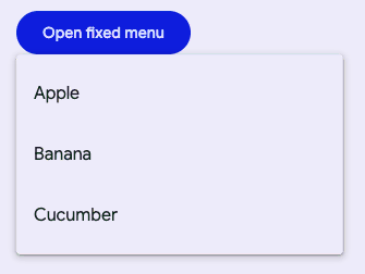
### Fixed-positioned menus
This is the fallback implementation of
[popover-positioned menus](#popover-positioned-menus) and uses `position: fixed`
rather than the default `position: absolute` which calculates its position
relative to the window rather than the element.
> Note: Fixed menu positions are positioned relative to the window and not the
> document. This means that the menu will not scroll with the anchor as the page
> is scrolled.
```html
Open fixed menu
Apple
Banana
Cucumber
```
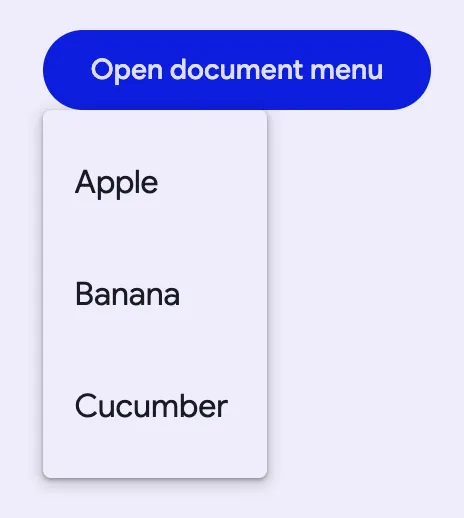
### Document-positioned menus
When set to `positioning="document"`, `md-menu` will position itself relative to
the document as opposed to the element or the window from `"absolute"` and
`"fixed"` values respectively.
Document level positioning is useful for the following cases:
- There are no ancestor elements that produce a `relative` positioning
context.
- `position: relative`
- `position: absolute`
- `position: fixed`
- `transform: translate(x, y)`
- etc.
- The menu is hoisted to the top of the DOM
- The last child of ``
- [Top layer](https://developer.mozilla.org/en-US/docs/Glossary/Top_layer)
- The same `md-menu` is being reused and the contents and anchors are being
dynamically changed
```html
Open document menu
Apple
Banana
Cucumber
```
## Accessibility
By default Menu is set up to function as a `role="menu"` with children as
`role="menuitem"`. A common use case for this is the menu button example, where
you would need to add keyboard interactions to the button to open the menu
([see W3C example](https://www.w3.org/WAI/ARIA/apg/patterns/menu-button/examples/menu-button-actions/)).
Menu can also be adapted for other use cases.
The role of the `md-list` inside the menu can be set with the `type` attribute.
The role of each individual `md-menu-item` can also be set with the `type`
attribute. Anything else slotted into the menu that is not a list item in most
cases should be set to `role="none"`, and `md-divider` should have
`role="separator"` and `tabindex="-1"`.
```html
```
## Theming
Menus support [Material theming](../theming/README.md) and can be customized in
terms of color. Additionally, `md-menu` composes `md-list`, and each menu item
extends `md-list-item` ([see theming documentation](./list#theming)), so most
the tokens for those components can also be used for Menu.
### Menu Tokens
Token | Default value
----------------------------------------- | ------------------------------------
`--md-menu-container-color` | `--md-sys-color-surface-container`
`--md-menu-container-shape` | `--md-sys-shape-corner-extra-small`
`--md-menu-item-container-color` | `--md-sys-color-surface-container`
`--md-menu-item-selected-container-color` | `--md-sys-color-secondary-container`
* [Menu tokens](https://github.com/material-components/material-web/blob/main/tokens/_md-comp-menu.scss)
* [Menu item tokens](https://github.com/material-components/material-web/blob/main/tokens/_md-comp-menu-item.scss)
* [List tokens](https://github.com/material-components/material-web/blob/main/tokens/_md-comp-list.scss)
* [List item tokens](https://github.com/material-components/material-web/blob/main/tokens/_md-comp-list-item.scss)
### Example
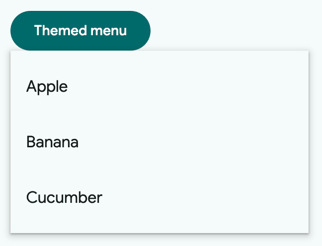
```html
Themed menu
```
## API
### MdMenu <md-menu>
#### Properties
| Property | Attribute | Type | Default | Description |
| --- | --- | --- | --- | --- |
| `anchor` | `anchor` | `string` | `''` | The ID of the element in the same root node in which the menu should align to. Overrides setting `anchorElement = elementReference`.
__NOTE__: anchor or anchorElement must either be an HTMLElement or resolve to an HTMLElement in order for menu to open. |
| `positioning` | `positioning` | `string` | `'absolute'` | Whether the positioning algorithm should calculate relative to the parent of the anchor element (`absolute`), relative to the window (`fixed`), or relative to the document (`document`). `popover` will use the popover API to render the menu in the top-layer. If your browser does not support the popover API, it will fall back to `fixed`.
__Examples for `position = 'fixed'`:__
- If there is no `position:relative` in the given parent tree and the surface is `position:absolute` - If the surface is `position:fixed` - If the surface is in the "top layer" - The anchor and the surface do not share a common `position:relative` ancestor
When using `positioning=fixed`, in most cases, the menu should position itself above most other `position:absolute` or `position:fixed` elements when placed inside of them. e.g. using a menu inside of an `md-dialog`.
__NOTE__: Fixed menus will not scroll with the page and will be fixed to the window instead.
__Examples for `position = 'document'`:__
- There is no parent that creates a relative positioning context e.g. `position: relative`, `position: absolute`, `transform: translate(x, y)`, etc. - You put the effort into hoisting the menu to the top of the DOM like the end of the `` to render over everything or in a top-layer. - You are reusing a single `md-menu` element that dynamically renders content.
__Examples for `position = 'popover'`:__
- Your browser supports `popover`. - Most cases. Once popover is in browsers, this will become the default. |
| `quick` | `quick` | `boolean` | `false` | Skips the opening and closing animations. |
| `hasOverflow` | `has-overflow` | `boolean` | `false` | Displays overflow content like a submenu. Not required in most cases when using `positioning="popover"`.
__NOTE__: This may cause adverse effects if you set `md-menu {max-height:...}` and have items overflowing items in the "y" direction. |
| `open` | `open` | `boolean` | `false` | Opens the menu and makes it visible. Alternative to the `.show()` and `.close()` methods |
| `xOffset` | `x-offset` | `number` | `0` | Offsets the menu's inline alignment from the anchor by the given number in pixels. This value is direction aware and will follow the LTR / RTL direction.
e.g. LTR: positive -> right, negative -> left RTL: positive -> left, negative -> right |
| `yOffset` | `y-offset` | `number` | `0` | Offsets the menu's block alignment from the anchor by the given number in pixels.
e.g. positive -> down, negative -> up |
| `noHorizontalFlip` | `no-horizontal-flip` | `boolean` | `false` | Disable the `flip` behavior that usually happens on the horizontal axis when the surface would render outside the viewport. |
| `noVerticalFlip` | `no-vertical-flip` | `boolean` | `false` | Disable the `flip` behavior that usually happens on the vertical axis when the surface would render outside the viewport. |
| `typeaheadDelay` | `typeahead-delay` | `number` | `200` | The max time between the keystrokes of the typeahead menu behavior before it clears the typeahead buffer. |
| `anchorCorner` | `anchor-corner` | `string` | `Corner.END_START` | The corner of the anchor which to align the menu in the standard logical property style of - e.g. `'end-start'`.
NOTE: This value may not be respected by the menu positioning algorithm if the menu would render outisde the viewport. Use `no-horizontal-flip` or `no-vertical-flip` to force the usage of the value |
| `menuCorner` | `menu-corner` | `string` | `Corner.START_START` | The corner of the menu which to align the anchor in the standard logical property style of - e.g. `'start-start'`.
NOTE: This value may not be respected by the menu positioning algorithm if the menu would render outisde the viewport. Use `no-horizontal-flip` or `no-vertical-flip` to force the usage of the value |
| `stayOpenOnOutsideClick` | `stay-open-on-outside-click` | `boolean` | `false` | Keeps the user clicks outside the menu.
NOTE: clicking outside may still cause focusout to close the menu so see `stayOpenOnFocusout`. |
| `stayOpenOnFocusout` | `stay-open-on-focusout` | `boolean` | `false` | Keeps the menu open when focus leaves the menu's composed subtree.
NOTE: Focusout behavior will stop propagation of the focusout event. Set this property to true to opt-out of menu's focusout handling altogether. |
| `skipRestoreFocus` | `skip-restore-focus` | `boolean` | `false` | After closing, does not restore focus to the last focused element before the menu was opened. |
| `defaultFocus` | `default-focus` | `string` | `FocusState.FIRST_ITEM` | The element that should be focused by default once opened.
NOTE: When setting default focus to 'LIST_ROOT', remember to change `tabindex` to `0` and change md-menu's display to something other than `display: contents` when necessary. |
| `noNavigationWrap` | `no-navigation-wrap` | `boolean` | `false` | Turns off navigation wrapping. By default, navigating past the end of the menu items will wrap focus back to the beginning and vice versa. Use this for ARIA patterns that do not wrap focus, like combobox. |
| `isSubmenu` | | `boolean` | `false` | Whether or not the current menu is a submenu and should not handle specific navigation keys. |
| `typeaheadController` | | `TypeaheadController` | `function { ... }` | Handles typeahead navigation through the menu. |
| `anchorElement` | | `HTMLElement & Partial` | `undefined` | |
| `items` | | `MenuItem[]` | `undefined` | |
#### Methods
| Method | Parameters | Returns | Description |
| --- | --- | --- | --- |
| `getBoundingClientRect` | _None_ | `DOMRect` | |
| `getClientRects` | _None_ | `DOMRectList` | |
| `close` | _None_ | `void` | |
| `show` | _None_ | `void` | |
| `activateNextItem` | _None_ | `MenuItem` | Activates the next item in the menu. If at the end of the menu, the first item will be activated. |
| `activatePreviousItem` | _None_ | `MenuItem` | Activates the previous item in the menu. If at the start of the menu, the last item will be activated. |
| `reposition` | _None_ | `void` | Repositions the menu if it is open.
Useful for the case where document or window-positioned menus have their anchors moved while open. |
#### Events
| Event | Type | [Bubbles](https://developer.mozilla.org/en-US/docs/Web/API/Event/bubbles) | [Composed](https://developer.mozilla.org/en-US/docs/Web/API/Event/composed) | Description |
| --- | --- | --- | --- | --- |
| `opening` | `Event` | No | No | Fired before the opening animation begins |
| `opened` | `Event` | No | No | Fired once the menu is open, after any animations |
| `closing` | `Event` | No | No | Fired before the closing animation begins |
| `closed` | `Event` | No | No | Fired once the menu is closed, after any animations |
### MdMenuItem <md-menu-item>
#### Properties
| Property | Attribute | Type | Default | Description |
| --- | --- | --- | --- | --- |
| `disabled` | `disabled` | `boolean` | `false` | Disables the item and makes it non-selectable and non-interactive. |
| `type` | `type` | `string` | `'menuitem'` | Sets the behavior and role of the menu item, defaults to "menuitem". |
| `href` | `href` | `string` | `''` | Sets the underlying `HTMLAnchorElement`'s `href` resource attribute. |
| `target` | `target` | `string` | `''` | Sets the underlying `HTMLAnchorElement`'s `target` attribute when `href` is set. |
| `keepOpen` | `keep-open` | `boolean` | `false` | Keeps the menu open if clicked or keyboard selected. |
| `selected` | `selected` | `boolean` | `false` | Sets the item in the selected visual state when a submenu is opened. |
| `typeaheadText` | | `string` | `undefined` | |
#### Events
| Event | Type | [Bubbles](https://developer.mozilla.org/en-US/docs/Web/API/Event/bubbles) | [Composed](https://developer.mozilla.org/en-US/docs/Web/API/Event/composed) | Description |
| --- | --- | --- | --- | --- |
| `close-menu` | `CustomEvent<{initiator: SelectOption, reason: Reason, itemPath: SelectOption[]}>` | Yes | Yes | Closes the encapsulating menu on closable interaction. |
### MdSubMenu <md-sub-menu>
#### Properties
| Property | Attribute | Type | Default | Description |
| --- | --- | --- | --- | --- |
| `anchorCorner` | `anchor-corner` | `string` | `Corner.START_END` | The anchorCorner to set on the submenu. |
| `menuCorner` | `menu-corner` | `string` | `Corner.START_START` | The menuCorner to set on the submenu. |
| `hoverOpenDelay` | `hover-open-delay` | `number` | `400` | The delay between mouseenter and submenu opening. |
| `hoverCloseDelay` | `hover-close-delay` | `number` | `400` | The delay between ponterleave and the submenu closing. |
| `isSubMenu` | `md-sub-menu` | `boolean` | `true` | READONLY: self-identifies as a menu item and sets its identifying attribute |
| `item` | | `MenuItem` | `undefined` | |
| `menu` | | `Menu` | `undefined` | |
#### Methods
| Method | Parameters | Returns | Description |
| --- | --- | --- | --- |
| `show` | _None_ | `Promise` | Shows the submenu. |
| `close` | _None_ | `Promise` | Closes the submenu. |
#### Events
| Event | Type | [Bubbles](https://developer.mozilla.org/en-US/docs/Web/API/Event/bubbles) | [Composed](https://developer.mozilla.org/en-US/docs/Web/API/Event/composed) | Description |
| --- | --- | --- | --- | --- |
| `deactivate-items` | `Event` | Yes | Yes | Requests the parent menu to deselect other items when a submenu opens. |
| `request-activation` | `Event` | Yes | Yes | Requests the parent to make the slotted item focusable and focus the item. |
| `deactivate-typeahead` | `Event` | Yes | Yes | Requests the parent menu to deactivate the typeahead functionality when a submenu opens. |
| `activate-typeahead` | `Event` | Yes | Yes | Requests the parent menu to activate the typeahead functionality when a submenu closes. |