# Floating action buttons (FAB)
**This documentation is fully rendered on the
[Material Web catalog](https://material-web.dev/components/fab/).**
[FAB](https://m3.material.io/components/floating-action-button)
represents the most important action on a screen. It puts key actions within
reach.
[Extended FABs](https://m3.material.io/components/extended-fab) help people take
primary actions. They're wider than FABs to accommodate a text label and larger
target area.
* Design articles
* [FAB](https://m3.material.io/components/floating-action-button)
* [Extended FAB](https://m3.material.io/components/extended-fab)
* API Documentation (*coming soon*)
* [Source code](https://github.com/material-components/material-web/tree/main/fab)
## Types

1. [FAB](#fab)
2. [Small FAB](#sizes)
3. [Large FAB](#sizes)
### Extended FAB

* [Extended FAB with both icon and label text](#extended)
* [API Documentation](#api)
* [Extended FAB without icon](#without-icon)
## Usage
FABs should have an icon, such as a font `md-icon`, an `svg`, or an `img`.
```html
edit
```
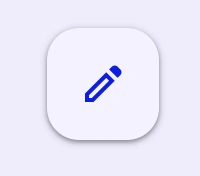
### Lowered
FABs can be set to a lower elevation with the `lowered` attribute.
```html
edit
```
## Accessibility
Icon-only FABs must include an `aria-label` that describes its action. Otherwise
if `aria-label` is not provided, the FAB will default to announcing its visible
contents.
```html
edit
```
Extended FABs use their `label` for accessibility. Add an `aria-label` for
additional context if needed. By supplying the `label` attribute, the extended
FAB will make sure that the icon is not announced.
```html
edit
```
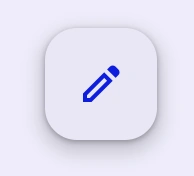
## FAB
FABs should display a clear and understandable icon.

```html
edit
```
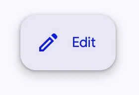
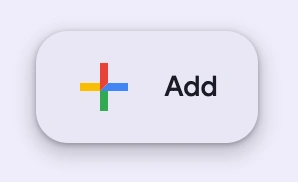
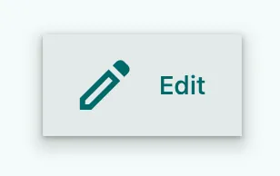
### Extended
FABs may be extended with a label for additional emphasis. Extended FABs can
omit their icon.
```html
edit
```
#### Without icon
Extended FABs are the only FABs that can be used without an icon.

```html
```
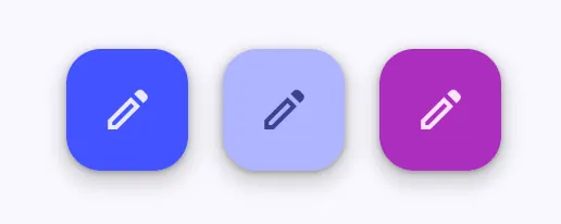
### Colors
FAB colors may be changed with the `variant` attribute. It can be set to
"surface" (default), "primary", "secondary", or "tertiary".
```html
editeditedit
```
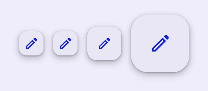
### Sizes
FABs may be small, medium (default), or large by setting the `size` attribute.
Small FABs can optionally further reduce their touch target.
```html
editediteditedit
```
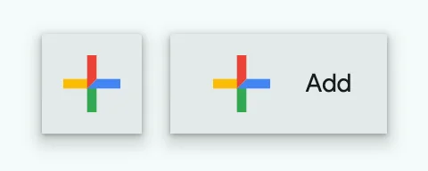
## Branded FAB
Branded FABs use a brightly colored logo for their icon. Unlike [FAB](#fab),
branded FABs do not have color variants.

```html
```
### Extended
Branded FABs may be extended with a label for additional emphasis. Unlike
[FAB](#fab), branded FABs should always display their logo icon.
```html
```
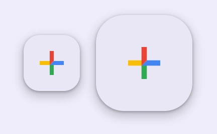
### Sizes
Branded FABs may be medium (default) or large by setting the `size` attribute.
```html
```
## Theming
FAB supports [Material theming](../theming/README.md) and can be customized in
terms of color, typography, and shape.
### FAB tokens
Token | Default value
---------------------------------- | ---------------------------------------
`--md-fab-container-color` | `--md-sys-color-surface-container-high`
`--md-fab-lowered-container-color` | `--md-sys-color-surface-container-low`
`--md-fab-container-shape` | `--md-sys-shape-corner-large`
`--md-fab-icon-color` | `--md-sys-color-primary`
`--md-fab-icon-size` | `24px`
* [All tokens](https://github.com/material-components/material-web/blob/main/tokens/_md-comp-fab.scss)
### FAB example

```html
edit
```
#### Sizes tokens
Token | Default value
-------------------------------- | -------------
`--md-fab-small-container-shape` | `--md-sys-shape-corner-medium`
`--md-fab-small-icon-size` | `24px`
`--md-fab-large-container-shape` | `--md-sys-shape-corner-extra-large`
`--md-fab-large-icon-size` | `36px`
#### Extended FAB tokens
Token | Default value
-------------------------- | -------------------------------------
`--md-fab-label-text-font` | `--md-sys-typescale-label-large-font`
#### Extended FAB example
```html
edit
```
### Branded FAB tokens
Token | Default value
---------------------------------- | ---------------------------------------
`--md-fab-branded-container-color` | `--md-sys-color-surface-container-high`
`--md-fab-branded-container-shape` | `--md-sys-shape-corner-large`
`--md-fab-branded-icon-size` | `36px`
`--md-fab-branded-label-text-font` | `--md-sys-typescale-label-large-font`
* [All tokens](https://github.com/material-components/material-web/blob/main/tokens/_md-comp-fab-branded.scss)
### Branded FAB example
```html
```
## API
### MdFab <md-fab>
#### Properties
| Property | Attribute | Type | Default | Description |
| --- | --- | --- | --- | --- |
| `variant` | `variant` | `string` | `'surface'` | The FAB color variant to render. |
| `size` | `size` | `string` | `'medium'` | The size of the FAB. NOTE: Branded FABs cannot be sized to `small`, and Extended FABs do not have different sizes. |
| `label` | `label` | `string` | `''` | The text to display on the FAB. |
| `lowered` | `lowered` | `boolean` | `false` | Lowers the FAB's elevation. |
### MdBrandedFab <md-branded-fab>
#### Properties
| Property | Attribute | Type | Default | Description |
| --- | --- | --- | --- | --- |
| `variant` | `variant` | `string` | `'surface'` | The FAB color variant to render. |
| `size` | `size` | `string` | `'medium'` | The size of the FAB. NOTE: Branded FABs cannot be sized to `small`, and Extended FABs do not have different sizes. |
| `label` | `label` | `string` | `''` | The text to display on the FAB. |
| `lowered` | `lowered` | `boolean` | `false` | Lowers the FAB's elevation. |
#### Methods
| Method | Parameters | Returns | Description |
| --- | --- | --- | --- |
| `getRenderClasses` | _None_ | `{ primary: boolean; secondary: boolean; tertiary: boolean; small: boolean; lowered: boolean; large: boolean; extended: boolean; }` | |