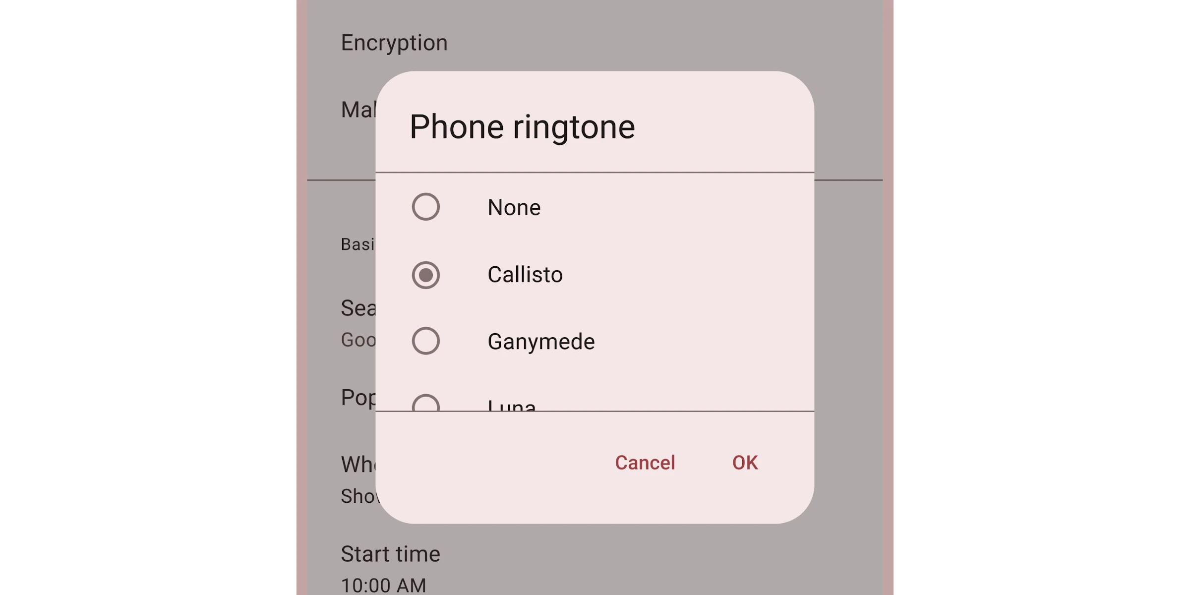
# Dialogs **This documentation is fully rendered on the [Material Web catalog](https://material-web.dev/components/dialog/)** [Dialogs](https://m3.material.io/components/dialogs) provide important prompts in a user flow. A dialog displaying phone ringtone options. * [Design article](https://m3.material.io/components/dialogs) * [API Documentation](#api) * [Source code](https://github.com/material-components/material-web/tree/main/dialog) ## Usage Dialogs behave like [``](https://developer.mozilla.org/en-US/docs/Web/API/HTMLDialogElement) elements, and can be closed with a `
` element. Dialogs have three optional sections: the headline title, the main content, and action buttons. ```html
Dialog title
A simple dialog with free-form content.
Ok
``` > Tip: use `margin`, `height`, and `width` CSS properties to control the > dialog's size and position. ### Opening and closing Dialogs are opened and closed by setting the `open` attribute or property. ```html
A dialog that is opened by default.
``` Dialogs are also opened and closed by calling `dialog.show()` and `dialog.close()`. Both return a Promise that resolves after the dialog's animation finishes. ```ts closeButton.addEventListener('click', async () => { await dialog.close(); }); ``` ### Return value A button's value attribute will set the dialog's `returnValue` property to identify which button closed it. ```html
...
Cancel Ok
``` ```ts dialog.addEventListener('close', () => { const cancelClicked = dialog.returnValue === 'cancel'; const okClicked = dialog.returnValue === 'ok'; }); ``` ## Accessibility Dialogs are labelled by their headlines. Add an [`aria-label`](https://developer.mozilla.org/en-US/docs/Web/Accessibility/ARIA/Attributes/aria-label) attribute to dialogs without a headline. ```html
An error occurred, details ...
``` ### Alerts Add a [`type="alert"`](https://developer.mozilla.org/en-US/docs/Web/Accessibility/ARIA/Roles/alertdialog_role) attribute to dialogs that need to communicate an important message and require a user's response. Common examples include error messages that require confirmation and other action confirmation prompts. ```html
Confirm deletion
Are you sure you wish to delete this item?
Cancel Delete
``` ## Theming Dialogs supports [Material theming](../theming/README.md) and can be customized in terms of color, typography, and shape. ### Tokens Token | Default value ----------------------------------- | --------------------------------------- `--md-dialog-container-color` | `--md-sys-color-surface-container-high` `--md-dialog-headline-color` | `--md-sys-color-on-surface` `--md-dialog-headline-font` | `--md-sys-typescale-headline-small-font` `--md-dialog-supporting-text-color` | `--md-sys-color-on-surface-variant` `--md-dialog-supporting-text-font` | `--md-sys-typescale-body-medium-font` * [All tokens](https://github.com/material-components/material-web/blob/main/tokens/_md-comp-dialog.scss) ### Example ```html
Title
Dialog content
``` ## API ### MdDialog <md-dialog> #### Properties | Property | Attribute | Type | Default | Description | | --- | --- | --- | --- | --- | | `quick` | `quick` | `boolean` | `false` | Skips the opening and closing animations. | | `returnValue` | | `string` | `''` | Gets or sets the dialog's return value, usually to indicate which button a user pressed to close it.
https://developer.mozilla.org/en-US/docs/Web/API/HTMLDialogElement/returnValue | | `type` | `type` | `string` | `undefined` | The type of dialog for accessibility. Set this to `alert` to announce a dialog as an alert dialog. | | `noFocusTrap` | `no-focus-trap` | `boolean` | `false` | Disables focus trapping, which by default keeps keyboard Tab navigation within the dialog.
When disabled, after focusing the last element of a dialog, pressing Tab again will release focus from the window back to the browser (such as the URL bar).
Focus trapping is recommended for accessibility, and should not typically be disabled. Only turn this off if the use case of a dialog is more accessible without focus trapping. | | `open` | `open` | `boolean` | `undefined` | | | `getOpenAnimation` | | `() => DialogAnimation` | `function { ... }` | Gets the opening animation for a dialog. Set to a new function to customize the animation. | | `getCloseAnimation` | | `() => DialogAnimation` | `function { ... }` | Gets the closing animation for a dialog. Set to a new function to customize the animation. | #### Methods | Method | Parameters | Returns | Description | | --- | --- | --- | --- | | `show` | _None_ | `Promise` | Opens the dialog and fires a cancelable `open` event. After a dialog's animation, an `opened` event is fired.
Add an `autofocus` attribute to a child of the dialog that should receive focus after opening. | | `close` | `returnValue` | `Promise` | Closes the dialog and fires a cancelable `close` event. After a dialog's animation, a `closed` event is fired. | #### Events | Event | Type | [Bubbles](https://developer.mozilla.org/en-US/docs/Web/API/Event/bubbles) | [Composed](https://developer.mozilla.org/en-US/docs/Web/API/Event/composed) | Description | | --- | --- | --- | --- | --- | | `open` | `Event` | No | No | Dispatched when the dialog is opening before any animations. | | `opened` | `Event` | No | No | Dispatched when the dialog has opened after any animations. | | `close` | `Event` | No | No | Dispatched when the dialog is closing before any animations. | | `closed` | `Event` | No | No | Dispatched when the dialog has closed after any animations. | | `cancel` | `Event` | No | No | Dispatched when the dialog has been canceled by clicking on the scrim or pressing Escape. |