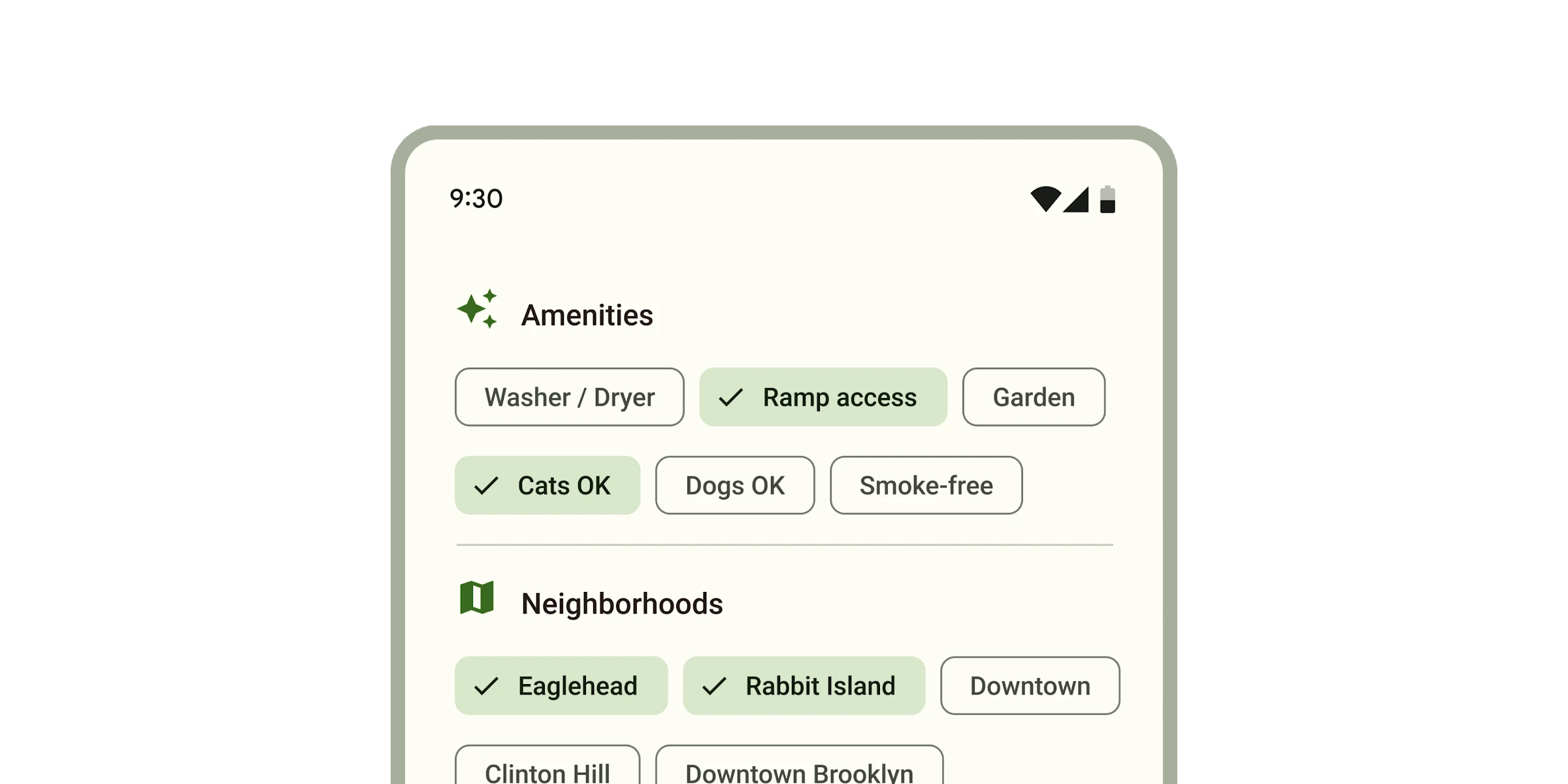
# Chips
**This documentation is fully rendered on the
[Material Web catalog](https://material-web.dev/components/chip/)**
[Chips](https://m3.material.io/components/chips) help people enter
information, make selections, filter content, or trigger actions.
While buttons are expected to appear consistently and with familiar calls to
action, chips should appear dynamically as a group of multiple interactive
elements.
 * [Design article](https://m3.material.io/components/chips)
* [API Documentation](#api)
* [Source code](https://github.com/material-components/material-web/tree/main/chips)
## Types
1. [Assist chip](#assist-chip)
1. [Filter chip](#filter-chip)
1. [Input chip](#input-chip)
1. [Suggestion chip](#suggestion-chip)
## Usage
Choose the type of chip based on its purpose and author.
- **Assist** chips are common actions, such as adding an event to a calendar.
- **Filter** chips are tags used to filter content, such as shopping
categories.
- **Input** chips are pieces of information entered by a user, such as event
attendees.
- **Suggestion** chips represent dynamic suggestions for user input, such as
text message replies.
```html
```
### Chip sets
Chips should always appear in a set. Chip sets are
[toolbars](https://developer.mozilla.org/en-US/docs/Web/Accessibility/ARIA/Roles/toolbar_role)
that can display any type of chip or other toolbar items.
```html
New event
```
### Icons
All chips may display an optional icon. Input chips can specify if an avatar
picture is displayed.
```html
event
 ```
### Elevated
Assist, filter, and suggestion chips can be elevated if the placement requires
protection, such as on top of an image.
```html
```
## Accessibility
Add an
[`aria-label`](https://developer.mozilla.org/en-US/docs/Web/Accessibility/ARIA/Attributes/aria-label)
attribute to chip sets or reference a label with
[`aria-labelledby`](https://developer.mozilla.org/en-US/docs/Web/Accessibility/ARIA/Attributes/aria-labelledby).
Add an `aria-label` to chips whose labels need to be more descriptive.
```html
```
### Elevated
Assist, filter, and suggestion chips can be elevated if the placement requires
protection, such as on top of an image.
```html
```
## Accessibility
Add an
[`aria-label`](https://developer.mozilla.org/en-US/docs/Web/Accessibility/ARIA/Attributes/aria-label)
attribute to chip sets or reference a label with
[`aria-labelledby`](https://developer.mozilla.org/en-US/docs/Web/Accessibility/ARIA/Attributes/aria-labelledby).
Add an `aria-label` to chips whose labels need to be more descriptive.
```html
Dates
```
### Focusable and disabled
By default, disabled chips are not focusable with the keyboard, while
"soft-disabled" chips are. Some use cases encourage focusability of disabled
toolbar items to increase their discoverability.
See the
[ARIA guidelines on focusability of disabled controls](https://www.w3.org/WAI/ARIA/apg/practices/keyboard-interface/#kbd_disabled_controls)
for guidance on when this is recommended.
```html
```
## Assist chip
[Assist chips](https://m3.material.io/components/chips/guidelines#5dd1928c-1476-4029-bdc5-fde66fc0dcb1)
represent smart or automated actions that can span multiple apps, such as
opening a calendar event from the home screen.
Assist chips function as though the user asked an assistant to complete the
action. They should appear dynamically and contextually in a UI.
```html
A restaraunt location
calendar
map
```
## Filter chip
[Filter chips](https://m3.material.io/components/chips/guidelines#8d453d50-8d8e-43aa-9ae3-87ed134d2e64)
use tags or descriptive words to filter content. They can be a good alternative
to toggle buttons or checkboxes.
```html
Choose where to share
```
### Removable
Filter chips can optionally be removable from the chip set. Removable chips have
a trailing remove icon.
```html
Colors
```
## Input chip
[Input chips](https://m3.material.io/components/chips/guidelines#4d2d5ef5-3fcd-46e9-99f2-067747b2393f)
represent discrete pieces of information entered by a user, such as Gmail
contacts or filter options within a search field.
Input chips whose icons are user images may add the `avatar` attribute to
display the image in a larger circle.
```html

 ```
### Remove-only
All input chips are removable. If an input chip does not have an action
associated with clicking on it, it may be marked as `remove-only`.
```html
```
### Remove-only
All input chips are removable. If an input chip does not have an action
associated with clicking on it, it may be marked as `remove-only`.
```html
Favorite movies
```
## Suggestion chip
[Suggestion chips](https://m3.material.io/components/chips/guidelines#36d7bb16-a9bf-4cf6-a73d-8e05510d66a7)
help narrow a user’s intent by presenting dynamically generated suggestions,
such as possible responses or search filters.
```html
Suggested reply
```
## Theming
Chips support [Material theming](../theming/README.md) and can be customized in
terms of color, typography, and shape.
### Assist chip tokens
Token | Default value
----------------------------------- | -------------------------------------
`--md-assist-chip-outline-color` | `--md-sys-color-outline`
`--md-assist-chip-container-shape` | `--md-sys-shape-corner-small`
`--md-assist-chip-icon-size` | `18px`
`--md-assist-chip-label-text-color` | `--md-sys-color-on-surface`
`--md-assist-chip-label-text-font` | `--md-sys-typescale-label-large-font`
* [All tokens](https://github.com/material-components/material-web/blob/main/tokens/_md-comp-assist-chip.scss)
### Assist chip example
```html
```
### Filter chip tokens
Token | Default value
------------------------------------------- | -------------
`--md-filter-chip-selected-container-color` | `--md-sys-color-secondary-container`
`--md-filter-chip-outline-color` | `--md-sys-color-outline`
`--md-filter-chip-container-shape` | `--md-sys-shape-corner-small`
`--md-filter-chip-icon-size` | `18px`
`--md-filter-chip-label-text-color` | `--md-sys-color-on-surface`
`--md-filter-chip-label-text-font` | `--md-sys-typescale-label-large-font`
* [All tokens](https://github.com/material-components/material-web/blob/main/tokens/_md-comp-filter-chip.scss)
### Filter chip example
```html
```
### Input chip tokens
Token | Default value
---------------------------------- | -------------------------------------
`--md-input-chip-outline-color` | `--md-sys-color-outline`
`--md-input-chip-container-shape` | `--md-sys-shape-corner-small`
`--md-input-chip-icon-size` | `18px`
`--md-input-chip-label-text-color` | `--md-sys-color-on-surface`
`--md-input-chip-label-text-font` | `--md-sys-typescale-label-large-font`
* [All tokens](https://github.com/material-components/material-web/blob/main/tokens/_md-comp-input-chip.scss)
### Input chip example
```html
```
### Suggestion chip tokens
Token | Default value
--------------------------------------- | -------------------------------------
`--md-suggestion-chip-outline-color` | `--md-sys-color-outline`
`--md-suggestion-chip-container-shape` | `--md-sys-shape-corner-small`
`--md-suggestion-chip-icon-size` | `18px`
`--md-suggestion-chip-label-text-color` | `--md-sys-color-on-surface`
`--md-suggestion-chip-label-text-font` | `--md-sys-typescale-label-large-font`
* [All tokens](https://github.com/material-components/material-web/blob/main/tokens/_md-comp-suggestion-chip.scss)
### Suggestion chip example
```html
```
## API
### MdChipSet <md-chip-set>
#### Properties
| Property | Attribute | Type | Default | Description |
| --- | --- | --- | --- | --- |
| `chips` | | `Chip[]` | `undefined` | |
### MdAssistChip <md-assist-chip>
#### Properties
| Property | Attribute | Type | Default | Description |
| --- | --- | --- | --- | --- |
| `elevated` | `elevated` | `boolean` | `false` | |
| `href` | `href` | `string` | `''` | |
| `target` | `target` | `string` | `''` | |
| `disabled` | `disabled` | `boolean` | `false` | Whether or not the chip is disabled.
Disabled chips are not focusable, unless `always-focusable` is set. |
| `softDisabled` | `soft-disabled` | `boolean` | `false` | Whether or not the chip is "soft-disabled" (disabled but still focusable).
Use this when a chip needs increased visibility when disabled. See https://www.w3.org/WAI/ARIA/apg/practices/keyboard-interface/#kbd_disabled_controls for more guidance on when this is needed. |
| `alwaysFocusable` | `always-focusable` | `boolean` | `false` | When true, allow disabled chips to be focused with arrow keys.
Add this when a chip needs increased visibility when disabled. See https://www.w3.org/WAI/ARIA/apg/practices/keyboard-interface/#kbd_disabled_controls for more guidance on when this is needed. |
| `label` | `label` | `string` | `''` | The label of the chip. |
| `hasIcon` | `has-icon` | `boolean` | `false` | Only needed for SSR.
Add this attribute when a chip has a `slot="icon"` to avoid a Flash Of Unstyled Content. |
#### Events
| Event | Type | [Bubbles](https://developer.mozilla.org/en-US/docs/Web/API/Event/bubbles) | [Composed](https://developer.mozilla.org/en-US/docs/Web/API/Event/composed) | Description |
| --- | --- | --- | --- | --- |
| `update-focus` | `Event` | Yes | No | Dispatched when `disabled` is toggled. |
### MdFilterChip <md-filter-chip>
#### Properties
| Property | Attribute | Type | Default | Description |
| --- | --- | --- | --- | --- |
| `elevated` | `elevated` | `boolean` | `false` | |
| `removable` | `removable` | `boolean` | `false` | |
| `selected` | `selected` | `boolean` | `false` | |
| `hasSelectedIcon` | `has-selected-icon` | `boolean` | `false` | Only needed for SSR.
Add this attribute when a filter chip has a `slot="selected-icon"` to avoid a Flash Of Unstyled Content. |
| `disabled` | `disabled` | `boolean` | `false` | Whether or not the chip is disabled.
Disabled chips are not focusable, unless `always-focusable` is set. |
| `softDisabled` | `soft-disabled` | `boolean` | `false` | Whether or not the chip is "soft-disabled" (disabled but still focusable).
Use this when a chip needs increased visibility when disabled. See https://www.w3.org/WAI/ARIA/apg/practices/keyboard-interface/#kbd_disabled_controls for more guidance on when this is needed. |
| `alwaysFocusable` | `always-focusable` | `boolean` | `false` | When true, allow disabled chips to be focused with arrow keys.
Add this when a chip needs increased visibility when disabled. See https://www.w3.org/WAI/ARIA/apg/practices/keyboard-interface/#kbd_disabled_controls for more guidance on when this is needed. |
| `label` | `label` | `string` | `''` | The label of the chip. |
| `hasIcon` | `has-icon` | `boolean` | `false` | Only needed for SSR.
Add this attribute when a chip has a `slot="icon"` to avoid a Flash Of Unstyled Content. |
| `handleTrailingActionFocus` | | `() => void` | `undefined` | |
| `ariaLabelRemove` | | `string` | `undefined` | |
#### Events
| Event | Type | [Bubbles](https://developer.mozilla.org/en-US/docs/Web/API/Event/bubbles) | [Composed](https://developer.mozilla.org/en-US/docs/Web/API/Event/composed) | Description |
| --- | --- | --- | --- | --- |
| `remove` | `Event` | No | No | Dispatched when the remove button is clicked. |
| `update-focus` | `Event` | Yes | No | Dispatched when `disabled` is toggled. |
### MdInputChip <md-input-chip>
#### Properties
| Property | Attribute | Type | Default | Description |
| --- | --- | --- | --- | --- |
| `avatar` | `avatar` | `boolean` | `false` | |
| `href` | `href` | `string` | `''` | |
| `target` | `target` | `string` | `''` | |
| `removeOnly` | `remove-only` | `boolean` | `false` | |
| `selected` | `selected` | `boolean` | `false` | |
| `disabled` | `disabled` | `boolean` | `false` | Whether or not the chip is disabled.
Disabled chips are not focusable, unless `always-focusable` is set. |
| `softDisabled` | `soft-disabled` | `boolean` | `false` | Whether or not the chip is "soft-disabled" (disabled but still focusable).
Use this when a chip needs increased visibility when disabled. See https://www.w3.org/WAI/ARIA/apg/practices/keyboard-interface/#kbd_disabled_controls for more guidance on when this is needed. |
| `alwaysFocusable` | `always-focusable` | `boolean` | `false` | When true, allow disabled chips to be focused with arrow keys.
Add this when a chip needs increased visibility when disabled. See https://www.w3.org/WAI/ARIA/apg/practices/keyboard-interface/#kbd_disabled_controls for more guidance on when this is needed. |
| `label` | `label` | `string` | `''` | The label of the chip. |
| `hasIcon` | `has-icon` | `boolean` | `false` | Only needed for SSR.
Add this attribute when a chip has a `slot="icon"` to avoid a Flash Of Unstyled Content. |
| `handleTrailingActionFocus` | | `() => void` | `undefined` | |
| `ariaLabelRemove` | | `string` | `undefined` | |
#### Events
| Event | Type | [Bubbles](https://developer.mozilla.org/en-US/docs/Web/API/Event/bubbles) | [Composed](https://developer.mozilla.org/en-US/docs/Web/API/Event/composed) | Description |
| --- | --- | --- | --- | --- |
| `remove` | `Event` | No | No | Dispatched when the remove button is clicked. |
| `update-focus` | `Event` | Yes | No | Dispatched when `disabled` is toggled. |
### MdSuggestionChip <md-suggestion-chip>
#### Properties
| Property | Attribute | Type | Default | Description |
| --- | --- | --- | --- | --- |
| `elevated` | `elevated` | `boolean` | `false` | |
| `href` | `href` | `string` | `''` | |
| `target` | `target` | `string` | `''` | |
| `disabled` | `disabled` | `boolean` | `false` | Whether or not the chip is disabled.
Disabled chips are not focusable, unless `always-focusable` is set. |
| `softDisabled` | `soft-disabled` | `boolean` | `false` | Whether or not the chip is "soft-disabled" (disabled but still focusable).
Use this when a chip needs increased visibility when disabled. See https://www.w3.org/WAI/ARIA/apg/practices/keyboard-interface/#kbd_disabled_controls for more guidance on when this is needed. |
| `alwaysFocusable` | `always-focusable` | `boolean` | `false` | When true, allow disabled chips to be focused with arrow keys.
Add this when a chip needs increased visibility when disabled. See https://www.w3.org/WAI/ARIA/apg/practices/keyboard-interface/#kbd_disabled_controls for more guidance on when this is needed. |
| `label` | `label` | `string` | `''` | The label of the chip. |
| `hasIcon` | `has-icon` | `boolean` | `false` | Only needed for SSR.
Add this attribute when a chip has a `slot="icon"` to avoid a Flash Of Unstyled Content. |
#### Events
| Event | Type | [Bubbles](https://developer.mozilla.org/en-US/docs/Web/API/Event/bubbles) | [Composed](https://developer.mozilla.org/en-US/docs/Web/API/Event/composed) | Description |
| --- | --- | --- | --- | --- |
| `update-focus` | `Event` | Yes | No | Dispatched when `disabled` is toggled. |

