# Select
**This documentation is fully rendered on the
[Material Web catalog](https://material-web.dev/components/select/)**
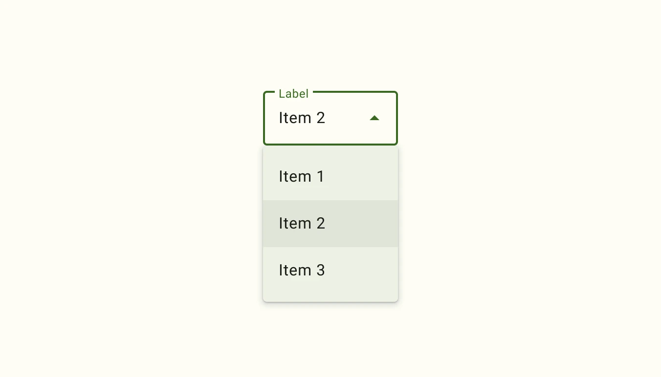
[Select menus](https://m3.material.io/components/menus/overview#b1704de4-94b7-4177-9e96-b677ae767cb4)
display a list of choices on temporary surfaces and display the currently
selected menu item above the menu.
* Design article (*coming soon*)
* [API Documentation](#api)
* [Source code](https://github.com/material-components/material-web/tree/main/select)
## Usage
Select (also referred to as a dropdown menu) allows choosing a value from a
fixed list of available options. It is analogous to the native HTML
[`` element](https://developer.mozilla.org/en-US/docs/Web/HTML/Element/select).

```html
Apple
Apricot
Apple
Apricot
```
### Required select
Indicate that a selection is mandatory by adding the `required` attribute.
```html
One
Two
```
## Theming
Select supports
[Material theming](https://github.com/material-components/material-web/blob/main/docs/theming/README.md)
and can be customized in terms of color, typography, and shape.
### Filled Select tokens
Token | Default value
------------------------------------------------ | -------------
`--md-filled-select-text-field-container-color` | `--md-sys-color-surface-container-highest`
`--md-filled-select-text-field-container-shape` | `--md-sys-shape-corner-extra-small`
`--md-filled-select-text-field-input-text-color` | `--md-sys-color-on-surface`
`--md-filled-select-text-field-input-text-font` | `--md-sys-typescale-body-large-font`
* [Filled Select tokens](https://github.com/material-components/material-web/blob/main/tokens/_md-comp-filled-select.scss)
To theme the select's dropdown menu, use the `md-menu` component tokens on the
`::part(menu)` selector.
### Filled Select example

```html
Apple
Tomato
```
### Outlined Select tokens
Token | Default value
-------------------------------------------------- | -------------
`--md-outlined-select-text-field-outline-color` | `--md-sys-color-outline`
`--md-outlined-select-text-field-container-shape` | `--md-sys-shape-corner-extra-small`
`--md-outlined-select-text-field-input-text-color` | `--md-sys-color-on-surface`
`--md-outlined-select-text-field-input-text-font` | `--md-sys-typescale-body-large-font`
* [Outlined Select tokens](https://github.com/material-components/material-web/blob/main/tokens/_md-comp-outlined-select.scss)
### Outlined Select example

```html
Apple
Tomato
```
## API
### MdFilledSelect <md-filled-select>
#### Properties
| Property | Attribute | Type | Default | Description |
| --- | --- | --- | --- | --- |
| `quick` | `quick` | `boolean` | `false` | Opens the menu synchronously with no animation. |
| `required` | `required` | `boolean` | `false` | Whether or not the select is required. |
| `errorText` | `error-text` | `string` | `''` | The error message that replaces supporting text when `error` is true. If `errorText` is an empty string, then the supporting text will continue to show. This error message overrides the error message displayed by `reportValidity()`. |
| `label` | `label` | `string` | `''` | The floating label for the field. |
| `noAsterisk` | `no-asterisk` | `boolean` | `false` | Disables the asterisk on the floating label, when the select is required. |
| `supportingText` | `supporting-text` | `string` | `''` | Conveys additional information below the select, such as how it should be used. |
| `error` | `error` | `boolean` | `false` | Gets or sets whether or not the select is in a visually invalid state. This error state overrides the error state controlled by `reportValidity()`. |
| `menuPositioning` | `menu-positioning` | `string` | `'popover'` | Whether or not the underlying md-menu should be position: fixed to display in a top-level manner, or position: absolute. position:fixed is useful for cases where select is inside of another element with stacking context and hidden overflows such as `md-dialog`. |
| `clampMenuWidth` | `clamp-menu-width` | `boolean` | `false` | Clamps the menu-width to the width of the select. |
| `typeaheadDelay` | `typeahead-delay` | `number` | `DEFAULT_TYPEAHEAD_BUFFER_TIME` | The max time between the keystrokes of the typeahead select / menu behavior before it clears the typeahead buffer. |
| `hasLeadingIcon` | `has-leading-icon` | `boolean` | `false` | Whether or not the text field has a leading icon. Used for SSR. |
| `displayText` | `display-text` | `string` | `''` | Text to display in the field. Only set for SSR. |
| `menuAlign` | `menu-align` | `string` | `'start'` | Whether the menu should be aligned to the start or the end of the select's textbox. |
| `value` | `value` | `string` | `undefined` | |
| `selectedIndex` | `selected-index` | `number` | `undefined` | |
| `disabled` | | `boolean` | `undefined` | |
| `name` | | `string` | `undefined` | |
| `options` | | `SelectOption[]` | `undefined` | |
| `selectedOptions` | | `SelectOption[]` | `undefined` | |
#### Methods
| Method | Parameters | Returns | Description |
| --- | --- | --- | --- |
| `select` | `value` | `void` | Selects an option given the value of the option, and updates MdSelect's value. |
| `selectIndex` | `index` | `void` | Selects an option given the index of the option, and updates MdSelect's value. |
| `reset` | _None_ | `void` | Reset the select to its default value. |
| `getUpdateComplete` | _None_ | `Promise` | |
| `formResetCallback` | _None_ | `void` | |
| `formStateRestoreCallback` | `state` | `void` | |
| `click` | _None_ | `void` | |
#### Events
| Event | Type | [Bubbles](https://developer.mozilla.org/en-US/docs/Web/API/Event/bubbles) | [Composed](https://developer.mozilla.org/en-US/docs/Web/API/Event/composed) | Description |
| --- | --- | --- | --- | --- |
| `change` | `Event` | Yes | No | The native `change` event on [` `](https://developer.mozilla.org/en-US/docs/Web/API/HTMLElement/change_event) |
| `input` | `InputEvent` | Yes | Yes | The native `input` event on [` `](https://developer.mozilla.org/en-US/docs/Web/API/HTMLElement/input_event) |
| `opening` | `Event` | No | No | Fired when the select's menu is about to open. |
| `opened` | `Event` | No | No | Fired when the select's menu has finished animations and opened. |
| `closing` | `Event` | No | No | Fired when the select's menu is about to close. |
| `closed` | `Event` | No | No | Fired when the select's menu has finished animations and closed. |
### MdOutlinedSelect <md-outlined-select>
#### Properties
| Property | Attribute | Type | Default | Description |
| --- | --- | --- | --- | --- |
| `quick` | `quick` | `boolean` | `false` | Opens the menu synchronously with no animation. |
| `required` | `required` | `boolean` | `false` | Whether or not the select is required. |
| `errorText` | `error-text` | `string` | `''` | The error message that replaces supporting text when `error` is true. If `errorText` is an empty string, then the supporting text will continue to show. This error message overrides the error message displayed by `reportValidity()`. |
| `label` | `label` | `string` | `''` | The floating label for the field. |
| `noAsterisk` | `no-asterisk` | `boolean` | `false` | Disables the asterisk on the floating label, when the select is required. |
| `supportingText` | `supporting-text` | `string` | `''` | Conveys additional information below the select, such as how it should be used. |
| `error` | `error` | `boolean` | `false` | Gets or sets whether or not the select is in a visually invalid state. This error state overrides the error state controlled by `reportValidity()`. |
| `menuPositioning` | `menu-positioning` | `string` | `'popover'` | Whether or not the underlying md-menu should be position: fixed to display in a top-level manner, or position: absolute. position:fixed is useful for cases where select is inside of another element with stacking context and hidden overflows such as `md-dialog`. |
| `clampMenuWidth` | `clamp-menu-width` | `boolean` | `false` | Clamps the menu-width to the width of the select. |
| `typeaheadDelay` | `typeahead-delay` | `number` | `DEFAULT_TYPEAHEAD_BUFFER_TIME` | The max time between the keystrokes of the typeahead select / menu behavior before it clears the typeahead buffer. |
| `hasLeadingIcon` | `has-leading-icon` | `boolean` | `false` | Whether or not the text field has a leading icon. Used for SSR. |
| `displayText` | `display-text` | `string` | `''` | Text to display in the field. Only set for SSR. |
| `menuAlign` | `menu-align` | `string` | `'start'` | Whether the menu should be aligned to the start or the end of the select's textbox. |
| `value` | `value` | `string` | `undefined` | |
| `selectedIndex` | `selected-index` | `number` | `undefined` | |
| `disabled` | | `boolean` | `undefined` | |
| `name` | | `string` | `undefined` | |
| `options` | | `SelectOption[]` | `undefined` | |
| `selectedOptions` | | `SelectOption[]` | `undefined` | |
#### Methods
| Method | Parameters | Returns | Description |
| --- | --- | --- | --- |
| `select` | `value` | `void` | Selects an option given the value of the option, and updates MdSelect's value. |
| `selectIndex` | `index` | `void` | Selects an option given the index of the option, and updates MdSelect's value. |
| `reset` | _None_ | `void` | Reset the select to its default value. |
| `getUpdateComplete` | _None_ | `Promise` | |
| `formResetCallback` | _None_ | `void` | |
| `formStateRestoreCallback` | `state` | `void` | |
| `click` | _None_ | `void` | |
#### Events
| Event | Type | [Bubbles](https://developer.mozilla.org/en-US/docs/Web/API/Event/bubbles) | [Composed](https://developer.mozilla.org/en-US/docs/Web/API/Event/composed) | Description |
| --- | --- | --- | --- | --- |
| `change` | `Event` | Yes | No | The native `change` event on [` `](https://developer.mozilla.org/en-US/docs/Web/API/HTMLElement/change_event) |
| `input` | `InputEvent` | Yes | Yes | The native `input` event on [` `](https://developer.mozilla.org/en-US/docs/Web/API/HTMLElement/input_event) |
| `opening` | `Event` | No | No | Fired when the select's menu is about to open. |
| `opened` | `Event` | No | No | Fired when the select's menu has finished animations and opened. |
| `closing` | `Event` | No | No | Fired when the select's menu is about to close. |
| `closed` | `Event` | No | No | Fired when the select's menu has finished animations and closed. |
### MdSelectOption <md-select-option>
#### Properties
| Property | Attribute | Type | Default | Description |
| --- | --- | --- | --- | --- |
| `disabled` | `disabled` | `boolean` | `false` | Disables the item and makes it non-selectable and non-interactive. |
| `selected` | `selected` | `boolean` | `false` | Sets the item in the selected visual state when a submenu is opened. |
| `value` | `value` | `string` | `''` | Form value of the option. |
| `type` | | `string` | `'option' as const` | |
| `typeaheadText` | | `string` | `undefined` | |
| `displayText` | | `string` | `undefined` | |
#### Events
| Event | Type | [Bubbles](https://developer.mozilla.org/en-US/docs/Web/API/Event/bubbles) | [Composed](https://developer.mozilla.org/en-US/docs/Web/API/Event/composed) | Description |
| --- | --- | --- | --- | --- |
| `close-menu` | `CustomEvent<{initiator: SelectOption, reason: Reason, itemPath: SelectOption[]}>` | Yes | Yes | Closes the encapsulating menu on closable interaction. |
| `request-selection` | `Event` | Yes | Yes | Requests the parent md-select to select this element (and deselect others if single-selection) when `selected` changed to `true`. |
| `request-deselection` | `Event` | Yes | Yes | Requests the parent md-select to deselect this element when `selected` changed to `false`. |