# Buttons
**This documentation is fully rendered on the
[Material Web catalog](https://material-web.dev/components/button/).**
[Buttons](https://m3.material.io/components/buttons) help people
initiate actions, from sending an email, to sharing a document, to liking a
post.
There are five types of common buttons: elevated, filled, filled tonal,
outlined, and text.
* [Design article](https://m3.material.io/components/buttons)
* [API Documentation](#api)
* [Source code](https://github.com/material-components/material-web/tree/main/button)
## Types

1. [Elevated button](#elevated-button)
1. [Filled button](#filled-button)
1. [Filled tonal button](#filled-tonal-button)
1. [Outlined button](#outlined-button)
1. [Text button](#text-button)
## Usage
Buttons have label text that describes the action that will occur if a user taps
a button.

```html
BackComplete
```
### Icon
An icon may optionally be added to a button to help communicate the button's
action and help draw attention.

```html
Send
Open
```
## Accessibility
Add an
[`aria-label`](https://developer.mozilla.org/en-US/docs/Web/Accessibility/ARIA/Attributes/aria-label)
attribute to buttons whose labels need a more descriptive label.
```html
Add
```
### Focusable and disabled
By default, disabled buttons are not focusable with the keyboard, while
"soft-disabled" buttons are. Some use cases encourage focusability of disabled
toolbar items to increase their discoverability.
See the
[ARIA guidelines on focusability of disabled controls](https://www.w3.org/WAI/ARIA/apg/practices/keyboard-interface/#kbd_disabled_controls)
for guidance on when this is recommended.
```html
CopyCutPaste
```
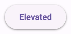
## Elevated button
[Elevated buttons](https://m3.material.io/components/buttons/guidelines#4e89da4d-a8fa-4e20-bb8d-b8a93eff3e3e)
are essentially filled tonal buttons with a shadow. To prevent shadow creep,
only use them when absolutely necessary, such as when the button requires visual
separation from a patterned background.
```html
Elevated
```
## Filled button
[Filled buttons](https://m3.material.io/components/buttons/guidelines#9ecffdb3-ef29-47e7-8d5d-f78b404fcafe)
have the most visual impact after the FAB, and should be used for important,
final actions that complete a flow, like Save, Join now, or Confirm.
```html
Filled
```
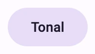
## Filled tonal button
A
[filled tonal button](https://m3.material.io/components/buttons/guidelines#07a1577b-aaf5-4824-a698-03526421058b)
is an alternative middle ground between filled and outlined buttons. They're
useful in contexts where a lower-priority button requires slightly more emphasis
than an outline would give, such as "Next" in an onboarding flow.
```html
Tonal
```
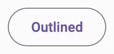
## Outlined button
[Outlined buttons](https://m3.material.io/components/buttons/guidelines#3742b09f-c224-43e0-a83e-541bd29d0f05)
are medium-emphasis buttons. They contain actions that are important, but aren’t
the primary action in an app.
```html
Outlined
```
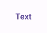
## Text button
[Text buttons](https://m3.material.io/components/buttons/guidelines#c9bcbc0b-ee05-45ad-8e80-e814ae919fbb)
are used for the lowest priority actions, especially when presenting multiple
options.
```html
Text
```
## Theming
Button supports [Material theming](../theming/README.md) and can be customized
in terms of color, typography, and shape.
### Elevated button tokens
Token | Default value
--------------------------------------- | -------------------------------------
`--md-elevated-button-container-color` | `--md-sys-color-surface`
`--md-elevated-button-container-shape` | `--md-sys-shape-corner-full`
`--md-elevated-button-label-text-color` | `--md-sys-color-on-surface`
`--md-elevated-button-label-text-font` | `--md-sys-typescale-label-large-font`
* [All tokens](https://github.com/material-components/material-web/blob/main/tokens/_md-comp-elevated-button.scss)
### Elevated button example

```html
Elevated
```
### Filled button tokens
Token | Default value
------------------------------------- | -------------------------------------
`--md-filled-button-container-color` | `--md-sys-color-primary`
`--md-filled-button-container-shape` | `--md-sys-shape-corner-full`
`--md-filled-button-label-text-color` | `--md-sys-color-on-primary`
`--md-filled-button-label-text-font` | `--md-sys-typescale-label-large-font`
* [All tokens](https://github.com/material-components/material-web/blob/main/tokens/_md-comp-filled-button.scss)
### Filled button example

```html
Filled
```
### Filled tonal button tokens
Token | Default value
------------------------------------------- | -------------
`--md-filled-tonal-button-container-color` | `--md-sys-color-secondary-container`
`--md-filled-tonal-button-container-shape` | `--md-sys-shape-corner-full`
`--md-filled-tonal-button-label-text-color` | `--md-sys-color-on-secondary-container`
`--md-filled-tonal-button-label-text-font` | `--md-sys-typescale-label-large-font`
* [All tokens](https://github.com/material-components/material-web/blob/main/tokens/_md-comp-filled-tonal-button.scss)
### Filled tonal button example

```html
Tonal
```
### Outlined button tokens
Token | Default value
--------------------------------------- | -------------------------------------
`--md-outlined-button-outline-color` | `--md-sys-color-outline`
`--md-outlined-button-container-shape` | `--md-sys-shape-corner-full`
`--md-outlined-button-label-text-color` | `--md-sys-color-primary`
`--md-outlined-button-label-text-font` | `--md-sys-typescale-label-large-font`
* [All tokens](https://github.com/material-components/material-web/blob/main/tokens/_md-comp-outlined-button.scss)
### Outlined button example

```html
Outlined
```
### Text button tokens
Token | Default value
----------------------------------- | -------------------------------------
`--md-text-button-label-text-color` | `--md-sys-color-primary`
`--md-text-button-label-text-font` | `--md-sys-typescale-label-large-font`
* [All tokens](https://github.com/material-components/material-web/blob/main/tokens/_md-comp-text-button.scss)
### Text button example

```html
Text
```
## API
### MdElevatedButton <md-elevated-button>
#### Properties
| Property | Attribute | Type | Default | Description |
| --- | --- | --- | --- | --- |
| `disabled` | `disabled` | `boolean` | `false` | Whether or not the button is disabled. |
| `softDisabled` | `soft-disabled` | `boolean` | `false` | Whether or not the button is "soft-disabled" (disabled but still focusable). Use this when a button needs increased visibility when disabled. See https://www.w3.org/WAI/ARIA/apg/practices/keyboard-interface/#kbd_disabled_controls for more guidance on when this is needed. |
| `href` | `href` | `string` | `''` | The URL that the link button points to. |
| `target` | `target` | `string` | `''` | Where to display the linked `href` URL for a link button. Common options include `_blank` to open in a new tab. |
| `trailingIcon` | `trailing-icon` | `boolean` | `false` | Whether to render the icon at the inline end of the label rather than the inline start. _Note:_ Link buttons cannot have trailing icons. |
| `hasIcon` | `has-icon` | `boolean` | `false` | Whether to display the icon or not. |
| `type` | `type` | `string` | `'submit'` | The default behavior of the button. May be "button", "reset", or "submit" (default). |
| `value` | `value` | `string` | `''` | The value added to a form with the button's name when the button submits a form. |
| `name` | | `string` | `undefined` | |
| `form` | | `HTMLFormElement` | `undefined` | |
### MdFilledButton <md-filled-button>
#### Properties
| Property | Attribute | Type | Default | Description |
| --- | --- | --- | --- | --- |
| `disabled` | `disabled` | `boolean` | `false` | Whether or not the button is disabled. |
| `softDisabled` | `soft-disabled` | `boolean` | `false` | Whether or not the button is "soft-disabled" (disabled but still focusable). Use this when a button needs increased visibility when disabled. See https://www.w3.org/WAI/ARIA/apg/practices/keyboard-interface/#kbd_disabled_controls for more guidance on when this is needed. |
| `href` | `href` | `string` | `''` | The URL that the link button points to. |
| `target` | `target` | `string` | `''` | Where to display the linked `href` URL for a link button. Common options include `_blank` to open in a new tab. |
| `trailingIcon` | `trailing-icon` | `boolean` | `false` | Whether to render the icon at the inline end of the label rather than the inline start. _Note:_ Link buttons cannot have trailing icons. |
| `hasIcon` | `has-icon` | `boolean` | `false` | Whether to display the icon or not. |
| `type` | `type` | `string` | `'submit'` | The default behavior of the button. May be "button", "reset", or "submit" (default). |
| `value` | `value` | `string` | `''` | The value added to a form with the button's name when the button submits a form. |
| `name` | | `string` | `undefined` | |
| `form` | | `HTMLFormElement` | `undefined` | |
### MdFilledTonalButton <md-filled-tonal-button>
#### Properties
| Property | Attribute | Type | Default | Description |
| --- | --- | --- | --- | --- |
| `disabled` | `disabled` | `boolean` | `false` | Whether or not the button is disabled. |
| `softDisabled` | `soft-disabled` | `boolean` | `false` | Whether or not the button is "soft-disabled" (disabled but still focusable). Use this when a button needs increased visibility when disabled. See https://www.w3.org/WAI/ARIA/apg/practices/keyboard-interface/#kbd_disabled_controls for more guidance on when this is needed. |
| `href` | `href` | `string` | `''` | The URL that the link button points to. |
| `target` | `target` | `string` | `''` | Where to display the linked `href` URL for a link button. Common options include `_blank` to open in a new tab. |
| `trailingIcon` | `trailing-icon` | `boolean` | `false` | Whether to render the icon at the inline end of the label rather than the inline start. _Note:_ Link buttons cannot have trailing icons. |
| `hasIcon` | `has-icon` | `boolean` | `false` | Whether to display the icon or not. |
| `type` | `type` | `string` | `'submit'` | The default behavior of the button. May be "button", "reset", or "submit" (default). |
| `value` | `value` | `string` | `''` | The value added to a form with the button's name when the button submits a form. |
| `name` | | `string` | `undefined` | |
| `form` | | `HTMLFormElement` | `undefined` | |
### MdOutlinedButton <md-outlined-button>
#### Properties
| Property | Attribute | Type | Default | Description |
| --- | --- | --- | --- | --- |
| `disabled` | `disabled` | `boolean` | `false` | Whether or not the button is disabled. |
| `softDisabled` | `soft-disabled` | `boolean` | `false` | Whether or not the button is "soft-disabled" (disabled but still focusable). Use this when a button needs increased visibility when disabled. See https://www.w3.org/WAI/ARIA/apg/practices/keyboard-interface/#kbd_disabled_controls for more guidance on when this is needed. |
| `href` | `href` | `string` | `''` | The URL that the link button points to. |
| `target` | `target` | `string` | `''` | Where to display the linked `href` URL for a link button. Common options include `_blank` to open in a new tab. |
| `trailingIcon` | `trailing-icon` | `boolean` | `false` | Whether to render the icon at the inline end of the label rather than the inline start. _Note:_ Link buttons cannot have trailing icons. |
| `hasIcon` | `has-icon` | `boolean` | `false` | Whether to display the icon or not. |
| `type` | `type` | `string` | `'submit'` | The default behavior of the button. May be "button", "reset", or "submit" (default). |
| `value` | `value` | `string` | `''` | The value added to a form with the button's name when the button submits a form. |
| `name` | | `string` | `undefined` | |
| `form` | | `HTMLFormElement` | `undefined` | |
### MdTextButton <md-text-button>
#### Properties
| Property | Attribute | Type | Default | Description |
| --- | --- | --- | --- | --- |
| `disabled` | `disabled` | `boolean` | `false` | Whether or not the button is disabled. |
| `softDisabled` | `soft-disabled` | `boolean` | `false` | Whether or not the button is "soft-disabled" (disabled but still focusable). Use this when a button needs increased visibility when disabled. See https://www.w3.org/WAI/ARIA/apg/practices/keyboard-interface/#kbd_disabled_controls for more guidance on when this is needed. |
| `href` | `href` | `string` | `''` | The URL that the link button points to. |
| `target` | `target` | `string` | `''` | Where to display the linked `href` URL for a link button. Common options include `_blank` to open in a new tab. |
| `trailingIcon` | `trailing-icon` | `boolean` | `false` | Whether to render the icon at the inline end of the label rather than the inline start. _Note:_ Link buttons cannot have trailing icons. |
| `hasIcon` | `has-icon` | `boolean` | `false` | Whether to display the icon or not. |
| `type` | `type` | `string` | `'submit'` | The default behavior of the button. May be "button", "reset", or "submit" (default). |
| `value` | `value` | `string` | `''` | The value added to a form with the button's name when the button submits a form. |
| `name` | | `string` | `undefined` | |
| `form` | | `HTMLFormElement` | `undefined` | |
